MY PORTFOLIO
UX DESIGN
Designed and developed a mobile app for Fresh N' Delish Bakery, focused on enhancing the customer experience by allowing users to browse the menu, customize orders, and schedule pickups with ease. The UX design process included conducting user research, developing personas, identifying user pain points, and mapping user journeys to inform functionality. Early stages involved brainstorming sessions and low-fidelity wireframes, followed by iterative prototyping, user testing, and design refinements to ensure an intuitive and seamless user interface tailored to the needs of the local bakery’s customer base.


Designed and developed a mobile app called HomeHub, aimed at helping roommates efficiently manage shared responsibilities such as chore tracking, grocery lists, and scheduling for shared spaces like bathrooms and laundry. The UX design process began with user research, including the creation of personas, identification of pain points, and mapping user journeys to define core problems. Brainstorming was conducted using the Crazy 8s technique, followed by the development of site maps and low-fidelity wireframes. Usability testing and affinity diagramming were used to organize feedback and uncover insights, leading to refined designs with a strong emphasis on accessibility and user-centered solutions.

This design artifact is a live website developed for Guiding Hope Counseling Center. Following an initial client consultation, the primary objective was to enhance brand awareness and improve accessibility for both current and prospective clients. Key goals included creating a centralized hub for essential resources such as online client forms, telehealth access, and a scheduling system that avoids conflicts with staff availability. This involved researching and selecting a scheduling platform that aligned with the center’s needs. The website provides clear information about the center’s services, location, and contact options. To ensure consistency with existing branding, I incorporated a cohesive color palette and typography that aligned with the business card and met client approval. The design process began with a sitemap and wireframe sketches to establish informational hierarchy and ensure intuitive navigation for all users.
WEBSITE DESIGN


This design artifact is a mockup created for Jessy’s Shoe Repair, focusing on establishing a strong and cohesive brand presence. Drawing inspiration from the company’s business card, I selected a complementary color scheme and typography to reflect their brand identity. The objective was to provide the client with a professional online presence, allowing potential customers to easily understand the services offered and connect with the company more effectively.


This design artifact is a website mockup developed for Nieves Drywall & Remodeling, aimed at attracting potential clients through a clean, user-friendly interface. The design emphasizes intuitive navigation, supported by a bold and cohesive color scheme and streamlined user flow to ensure a seamless and engaging browsing experience.
DATA VISUALIZATION
Social Media Usage Infographic

This design artifact is an infographic created for Tech Crowd, aimed at presenting data-driven insights on social media usage across demographic groups. The objective was to uncover meaningful patterns by analyzing the relationships between time, age group, and usage percentage. To communicate these findings, I utilized three distinct, visually engaging graphs that break down the data in an accessible and professional format. Following the company’s style guide, I incorporated brand typography, brand colors, blending some for added visual variation, and maintained a cohesive aesthetic throughout. The infographic was developed using Adobe Illustrator’s graph tools, with data imported directly from Excel for accuracy and efficiency.
Sales Key Findings Infographic

This design artifact is an infographic created for Donut Bytes, designed to highlight key sales insights from the second half of the year. Through data analysis, notable trends were identified in monthly sales performance, seasonal flavor spikes, and overall flavor popularity. To effectively communicate these findings, I created three clear and visually engaging graphs that made the data easy to interpret. Adhering to the company’s style guide, I applied brand typography and colors, blending some shades to enhance visual appeal, while maintaining a cohesive and professional design. The infographic was developed using Adobe Illustrator’s graph tools, with data imported directly from Excel to ensure accuracy.
BRANDING


This design artifact is a brand style guide created for BeatsFest, a new music streaming service aimed primarily at Gen Z and some Millennials who appreciate a clean yet energetic aesthetic. The guide includes essential brand elements such as logo usage, typography, color palette, brand vision, and target audience insights, all designed to communicate the brand’s identity clearly and consistently. It serves as a centralized reference for both new and existing team members working on brand-related projects.
The guide reflects thoughtful design decisions grounded in market research and the brand’s goals, showcasing the designer’s strengths in creating cohesive visual elements like the logo, color scheme, and layout. It is visually engaging, easy to navigate, and effectively communicates the brand's personality.
PRINT DESIGN
Book Cover - Mysteries of the Forgotten House

This design artifact is a complete book cover set—including the front, back, spine, and inside slip—created for a horror/mystery novel targeting adult fans of the genre. The goal was to attract the intended audience through effective use of typography, imagery, and layout. The design aimed to make a strong first impression while visually conveying the book's tone. Principles like alignment, contrast, and balance were used alongside careful attention to print specifications such as bleed and margins.
This piece is a strong example of the designer’s ability to pair fonts with a theme and arrange content in a professional, visually engaging way. Image selection and manipulation played a key role, with AI tools used to refine the visual tone and composition. Overall, the book cover successfully captures the eerie, mysterious mood of the story while maintaining clarity and visual appeal for the target audience.
WEBSITE DESIGN
Flyer - Community Cup Opening

This flyer was designed to promote the grand opening of a new coffee shop targeting students and young adults seeking a place to study and connect. The goal was to present key information, such as the event banner, sale, date/location, and social media tags, while maintaining a strong brand presence. The design emphasizes balance, alignment, and hierarchy, using repeated coffee bean elements to draw attention to the central illustration and slogan, "Community Cup." This piece highlights core design principles like movement, balance, and typography, with a rustic and friendly tone. While the result effectively communicates the intended message, future updates could improve visibility of the event details and sale information.

This brochure for Piddle Paddle Tours promotes the company’s boat tour services to a broad audience, including couples, families, and vacationers of all ages. It features key business details, tour highlights, and engaging visuals in a compact, interactive format. The design employs modular grids, complementary fonts, and consistent hierarchy to ensure clarity, while thoughtful use of color, spacing, and print design elements, such as bleeds and folds, enhances both readability and professionalism. This piece demonstrates strong print design skills and effectively conveys the brand’s tone and offerings in a cohesive, visually appealing way.
DIGITAL DESIGN
This artifact promotes a new exhibit intended for distribution via email to an audience already familiar with the institution. It highlights guest artists by featuring their names, collection titles, exhibit dates and location, and sections including artist bios, portraits, and sample artworks. The design emphasizes clarity and artistic appeal, using a six-column hierarchical grid for consistent alignment and flow. Typography choices include bold headers with a semi-decorative font to reflect the creative nature of the content, balanced by structured subtext and details. Color palettes were carefully selected to complement each artist's work, while contrast and white space guide the viewer’s attention and maintain visual structure. A standout feature is the seamless visual connection between sections, designed to create a cohesive scrolling experience. This piece demonstrates my ability to combine strong layout principles with artistic expression to effectively support and showcase creative content.

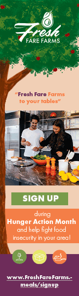
This design artifact is a skyscraper-style digital advertisement created for Fresh Fare Farms, a healthy food delivery service targeting diverse young adults aged 18 to 35. Designed to appear on the side of a computer screen during browsing, the ad integrates bold colors, sans-serif typography, and dynamic graphics to convey the brand’s identity and encourage sign-ups through a clear call-to-action. The design balances visual appeal with information clarity, showcasing my ability to create engaging, organized layouts. A standout feature is a custom tree graphic that adds artistic flair and vertical emphasis. While the chosen imagery supports the concept, I recognize room for refinement, particularly in selecting a more focused visual element